QR codes in OOH: the good, the bad and the (usually) ugly
Opinion
Should you incorporate QR codes in to your campaigns? Clear Channel’s marketing director warns advertisers that consumers’ experience should be paramount.
The humble QR code has become a more prominent feature of our lives over the past few years, as access to vital testing or venue tracking became a regular occurrence.
The majority (86%) of smartphone users have scanned one in the UK. Four in 10 are doing so weekly.
The functionality of the technology is as great as it’s ever been with almost everyone with a smartphone needing no specific app other than the native camera to activate them.
And marketers have seized this glorious chance.
QR codes are finding their way into advertising campaigns and retail displays as a simple way to connect the real-world with digital experiences too. Not a bad aim.
I’ve also seen them used a lot more in out-of-home (OOH) campaigns we’re running, and out there live on the streets.
It feels like an easy win, doesn’t it? Add it in. It will become ‘trackable’. Users will scan.
However…
Some integrations of QR codes I see on posters offer no further thought to a good consumer experience, or are almost so illegible or out of context, their inclusion seems, to me at least, virtually worthless.
I saw a fantastic presentation from Havas’s Dan Hagen on Mx (“Media Experience”) and I think this conversation falls squarely into that discussion.
Is a simple scan enough?
It’s our job to improve people’s media experience. Which is why I ask — is a simple scan sufficient?
The objective here is to open the conversation between client, creative, media and media owner — with the idea to make a more effective use of the channel, better implement QR codes, as well as when, how and if to use them.
The key considerations:
· Environment. The best use of QR codes will be on formats and in Out-of-Home environments which provide audiences enough dwell time to scan and engage. Pedestrian locations over predominantly roadside sites.
· Ease. Make sure the QR code is easy to be scanned — up from the ground, large enough to be scanned from a slight distance, with a clear call to action to explain what’s in it for those who scan (and that it actually works!)
· Exchange. Give people a solid value exchange. A simple link to a homepage is nothing a simple google search couldn’t do. Provide specific links (e.g. for fashion, a link to what’s shown on the ad, or for a film release — local cinema times), deeper engagement or value such as vouchers, trials, discounts or incentives.
Let’s look at a few examples: the good, the bad, the ugly and the beautiful.
The good
The best examples of QR codes being added to posters are consistently two things: they’re well-integrated into the design; and they provide added value for the customer.
They can bridge the gap between your physical creative and more information or in-depth digital content, as well as providing something of value to the people you’re trying to reach – exclusive content, discounts, product trial or finding specific information easier – a map, a collection of products, a recipe, or directions for example.
Café Rouge
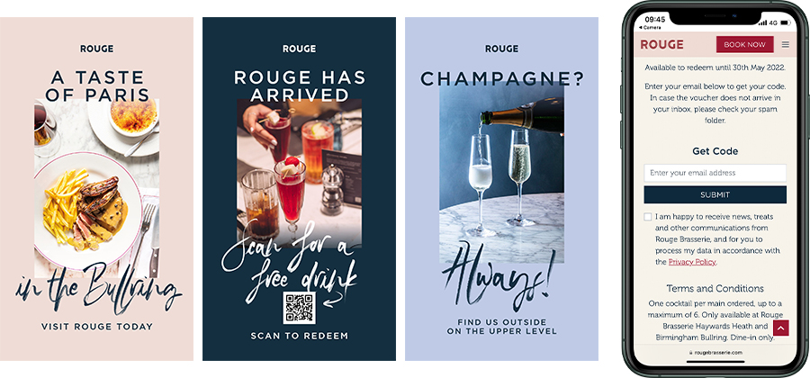
As part of multi-creative store opening campaign at the Bullring Mall in Birmingham, Café Rouge used one of their creatives to offer a free drink to capture data and encourage people through their doors.
The creative messaging is simple, clear, directive, offers a single call to action, as well as added value, and an easy experience for their audience.
Within the Bullring, the DOOH screens are elevated from floor to eye level, meaning the QR code being at the bottom of the creative still makes for ease of scanning.
Mighty Milk
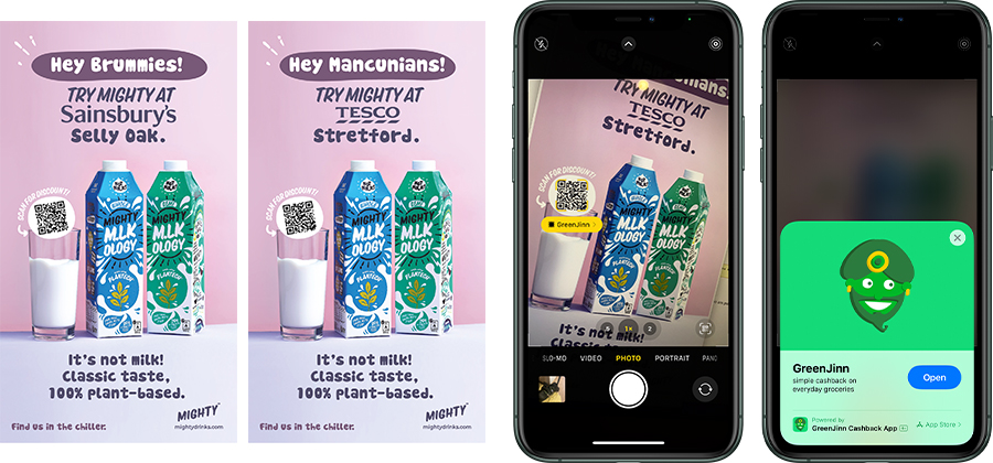
A great example of incorporating a QR code within the design, a QR code at a good height and size within the poster design for easy scanning and providing a simple pay off and user experience for the customers.
The ad also goes further by being contextual to location for added attention, as well as driving activation by making it easy to know where to purchase locally with your newly obtained discount in hand.
This campaign is mostly DOOH roadside, so the QR code being mid-height makes for easier interaction.
Campaign Against Living Miserably
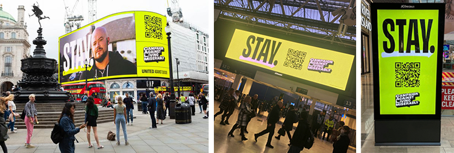
A long-time advocate of OOH, CALM have incorporated a QR code prominently in a powerful message encouraging potentially suicidal individuals that “someone wants them to stay.”
Strong contrast, a powerful message, great use of brand assets across multiple Out-of-Home formats, a single call to action, and deep, engaging, immersive – as well as potentially life-saving content upon interaction. An excellent example.
Arguably, maybe you need to know the brand already to get an understanding or desire to click through, but to me, the message is powerful, particularly if you consider the intended recipient and their potential state of thoughts and mind.
Tips
- Provide a pay-off
- Do something good
- Make it easy
The bad
And on some examples that aren’t so great – those posters which tend to contain QR codes which are too small, difficult to see, offer no clear call to action or added value, provide a call-to-action which is already on the poster, or an experience sin, those which are actually impossible to scan. D’oh.
Gap | YZY
By all accounts, the Gap YZY campaign featuring a QR code campaign recently was a success.
So much so, according to AdAge, the campaign received so many scans that the volume of traffic even crashed the website.
That was, however, not my own experience, where the media placement and execution meant I couldn’t scan the QR code.
My advice here, and as always for designing OOH campaigns, is to consume and test your creative asset in the real world, as your user will, and not on a computer screen in front of you.

Legibility
Across our Powerful Posters content series, we often talk about making sure that core messages and call to actions are both clear and legible, otherwise they’re adding confusion and clutter, turning off potential customers rather than encouraging interaction.
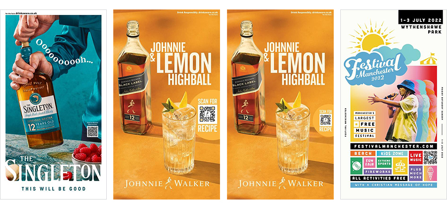
A couple of examples of campaigns below, with useful and/or engaging digital extensions, where the incorporation of QR codes might work on a press ad, but are potentially too small or hidden for DOOH executions in the real world.
Tips
- Make it legible
- Add some explanation
- Make sure it works!
The ugly
QR codes tend to be ugly; let’s be honest. They can be useful, but they’re not the best-looking elements to incorporate into a design.
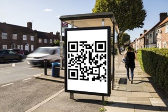
So, I’m categorising the below campaign, from Prestige Flowers, in the ugly category, (sorry), as it is entirely made up of nothing but a QR code. Literally, nothing.
Whilst I applaud brave marketing, and we can see a sense that this campaign is trying to build enough intrigue to scan, is this a valuable or smart way of using Out-of-Home? Is it memorable? To me, not so much.
According to the client, the campaign delivered 8,000 scans. Whilst that might sound impressive, how many impressions have been wasted with no incorporation of a legible logo or distinctive brand asset. And of those 8,000 scans, how many are genuine potential customers?
This campaign has essentially delivered just 8,000 impressions.
Intriguing maybe, but to me, missing the major superpower of OOH – reach.
Beautiful
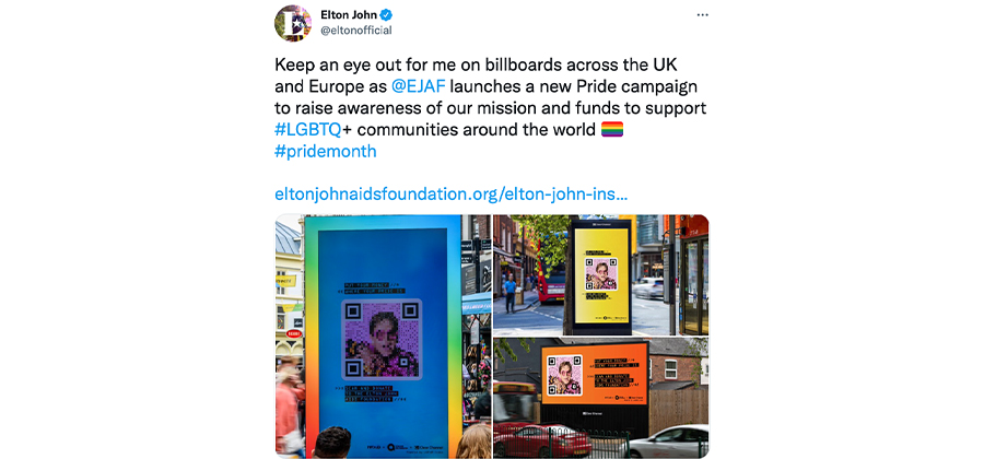
For Pride month, Clear Channel had the privilege to work alongside creative powerhouse Ogilvy to conceive, create and launch the beautiful ‘LGBTQR code’.
A QR code to help people ‘put money where your pride is’. In partnership with the Elton John Aids Foundation, and endorsed and promoted by the main man himself, the QR code more resembles a piece of art than a QR code. Beautifully designed and delivered.
I love the campaign that has action and purpose at it’s core, the QR code is beautiful and we’ve washed the streets with colour, pride and vibrancy.
Ever the critic, I would have loved to have seen the copy be shorter and more clear to help drive engagement on the Adshel Live creative, more akin to the Billboard Live creative shown in Elton’s tweet.
What do the experts say?
I also thought it might be good to get the input of some industry experts and their top tips for including, not including or how to include QR codes:
Vikki Ross, copy chief and consultant, writes: “Sadly, many brands lack confidence in expressing themselves through their distinctive brand assets but that’s why they created them; to help them express themselves in anything anywhere – and to help them build an identity that always connects people back to the brand.
“They have all the tools to do this but often miss a creative opportunity. And creative opportunities are everywhere — even in QR codes. Weetabix know this, which is why they use one of their distinctive brand assets — their product shape – to display a QR code on their packaging. In posters, QR codes could fit in the copy — if done creatively and clearly – rather than floating around making the place look untidy. Stick it in a hole in a letter — no one will miss it if they’re reading the writing.”
Dan Hagen, EVP managing director, global head of MX development, Havas Media Group, said: “QR codes are a really interesting microcosm of the relationship between media innovation (that we get so excited about) and consumer reality (sorry, but they mostly don’t care).
“It took a global pandemic to make something we’ve been messing around with for well over 10 years, into something that got mass consumer adoption — because it provided utility — check-ins for track & trace, menus in restaurants, etc. Now, it’s up to us as marketers to use them well and capitalise on that natural usage — make them useful, integrate them well — ultimately use them to improve the experience rather than trying to make people do something they don’t want to do or care about.”
Hugh Todd, co-founder of Behind the Billboard: “I’m not against them per se, I think they have a rejuvenated role in our modern society – I just think there’s a time and place for them. In a medium which by nature needs to be brief, maybe if the QR code is there to get rid of a headline, logo, key visual, end line, a website and a hashtag, then it can serve purpose.
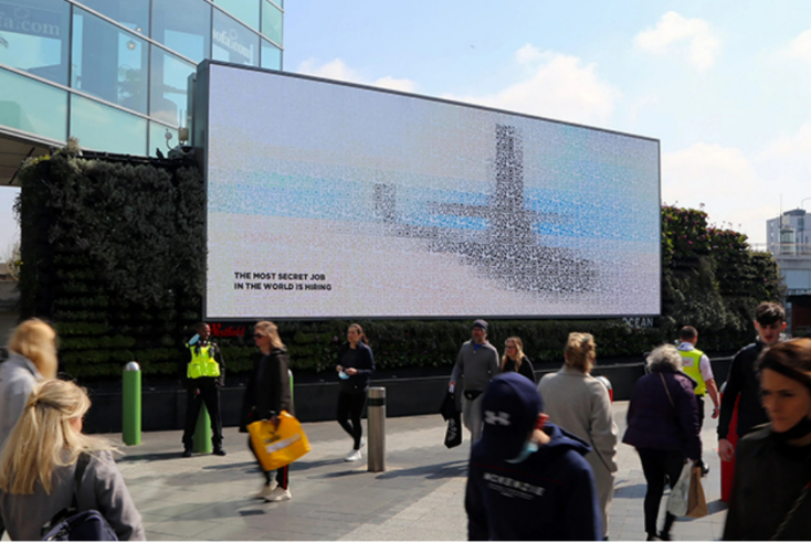
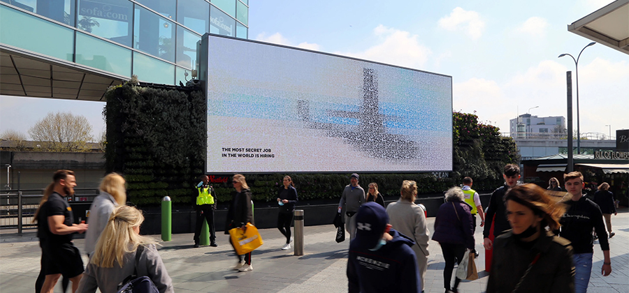
“I want the QR code to be the idea, rather than clogging up the creative. There was an excellent example from the Royal Navy where the entire poster was made up for QR codes which formed a faint image of a submarine, when scanned provided a job application. Just a simple line reading ‘The most secret job in the world’. The QR code was intrinsic to the idea, alongside smart copy. As Hegarty said, ‘if it’s not adding anything, don’t put it in’. I agree.”
What are your best examples? Let us know in the comments below…
Ben Hope is marketing director at Clear Channel UK.


